
Big Data Vs. Small Data: What's The Proper Prescription For You?
By Ben Locwin, Ph.D.
 We’ve all been exposed to the term “Big Data,” and many think they know what it’s all about. But let me share a story with you: I was just chairman for a healthcare conference, and I asked the producer what the most challenging themes have been recently within his conference business. “Blockchain,” he responded exasperatedly, “Every company sends people to figure it out, and when they leave, nobody knows what the conference was actually about.” And so it is with Big Data, where misperception is much more common than euperception (proper perception). This article will explain what Big Data and small data are, build your fluency with the benefits and risks of each, and provide recommendations to improve our data-rich future.
First, What Is Big Data?
Big data refers to tremendously large volumes of data that exist due to massively tracked variables across all of society. All of your cyber footprints across the internet are part of Big Data, which is why you’ll get an ad from Macy’s for shoes (or whatever) when searching the web for the latest details on blockchain (or not, as the case may be).
[Incidentally, blockchain is a methodology for a secure list of time-sequenced records between parties. It’s been a core component of Bitcoin since about 2009, where it functions as the system’s ledger.]
Online purchases for travel, credit card use at the gas pump, and geospatial coordinates for your smartphone’s map app (unless you’ve opted out) are all examples of Big Data. From it, companies can try to create more effective marketing campaigns targeted specifically to you. Much of this dates back to early digital architecture at Yahoo! in the mid-1990s.1 So these massive databases of information about us, some of which follow us (the cloud), are the eponymous Big Data sets. They track our preferences (think Pandora, iTunes, Amazon Prime Music, and other such artistic-delivery apps). They allow for marketers to know more about people than many people know about themselves. (For example, people who have a positive emotional experience when buying from a company are 15x more likely to recommend that company.)2
So What’s The Problem With Big Data?
Principally, what’s wrong with Big Data is the “people factor” underpinning its analysis. Those who collect Big Data to theorize new marketing strategies to change buying patterns have a real “jump to conclusions” bias. In fact, it’s not just the Big Data analysts — it’s all of us. Humans have a tendency to fall prey to what Michael Shermer calls “patternicity,” which is our cognitive bent toward developing quick correlations for what we see or experience.3 This is an evolutionary holdover from ancient epochs where, if we hear rustling in the bushes, it’s much safer to think that a predator is nearby than to think it is simply the wind (where detecting a false positive is much more evolutionarily favorable than assuming a false negative).
Think about the “playoff beard.” Teams that have gone on winning streaks and correlated their performance with being unshaven will continue to rely on this behavior through a heuristic known as post hoc, ergo propter hoc — from this, therefore because of this. This is an extraordinarily common bias that people tend to carry with them.

Nice beard. It must be helping your probability of a win. (Photo by Michael Miller [CC BY-SA 4.0] via Wikimedia Commons)
Now, like winning streaks — and streakiness in general — we try to find patterns among meaningless data. Another phenomenon that is written about ad infinitum and discussed almost as much in sports narratives is that of the “hot hand.” More correctly, this is known as the “hot-hand fallacy” because it’s a complete statistical falsehood. If a baseball player just got a hit, then gets another hit in his next at-bat, well then — he must be on a roll! Our expectation is weighted so heavily in favor of him getting a hit in his third at-bat that we experience real emotional pain if he (randomly) strikes out. These so-called serial correlations often happen in basketball, too — in fact, they occur in almost every single sport in the world. Hit two three-pointers in a row? The next one must be destined for success, as well. Even rhesus monkeys fall prey to believing in the hot- hand bias.4
So as we analyze Big Data, patterns in the data that appear correlated — even acausal ones — cause our brain’s limbic reward system to light up because we think we’ve found something(!). Here’s the problem: As data sets get larger and larger (which obviously occurs with Big Data), we are guaranteed to find correlations with enough variables ... just by chance. This leads to findings such as “tree nut consumption” being strongly correlated with “customer satisfaction of Domino’s Pizza,” with an r2 of ~ .94.5
We see infographics making the rounds with such precision that we think they must be accurate. (“Wow, did you realize that 89% of customers [do something]?” or “Isn’t it amazing that 72% of companies would switch their [vendor] if [insert option here]?”) Infographics work specifically because they tap into a psychological bias to believe that a precise-looking statistic must have veracity on its side. But the numbers captured in an infographic are more often total junk science than they are relevant pieces of data.6
Until I started chastising companies to list the sample size within their infographics, most never even included this critically important piece of informative context (and most still don’t include it, by the way). Creating an infographic from some Big Data sets that never had an a priori hypothesis? You’re fabricating fake conclusions.
Let’s say you conducted a consumer preference study using your Big Data sets. Your multiple regressions may cause you to find that “recency of in-store repainting” is related to customer spend. Don’t generalize this result. It’s probably a red herring correlation, and you’d best look beyond the superficial results to determine causality. In fact, I'm doing contemporary research on what's called "design placebo," and it is possible that certain environmental factors contribute to a "positivity" response in customers. But this only works in very specific circumstances, and if you are finding these associations by chance and aren't using a controlled experiment, you're building a false narrative.
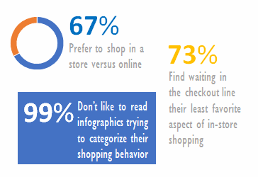
Doesn’t the assumed precision of a poorly-derived statistic make you feel very confident? (Infographic courtesy of the author)
In this figure above, first of all, there is no indication of what the sample size is, so there’s no way we can estimate our confidence in generalizability of this data. If 67 percent of the shopping public preferred to shop in-store vs. online, then online wouldn’t be demolishing month-to-month sales of any particular retailer. Though this infographic makes us believe that 73 percent of customers find waiting in checkout to be their least favorite aspect of in-store shopping, the survey must have included in its small sample group the only 12 people on Earth who would say that it wasn't their least favorite aspect — nobody heads into a store with positive, forward-looking thoughts about how pleasurable their waiting-in-line experience will be. The actual number is likely to be asymptotically approaching 100 percent.
Why The Flu Doesn’t Care What Big Data Thinks
In 2013, Science published an article called “The Parable of Google Flu.”7 In it, the authors discussed how Google had determined in 2012 that it could accurately predict (read: forecast) upcoming flu endemics and clusters based on search results queried across users. The underlying assumption was that if you felt unwell, you would search for “flu” or some derivative. However, the actual data showed that Google’s predictive model was off (read: wrong) by a factor of two or more. Assumptions of human behavior and Big Data modeling didn’t match the contagion vectoring through actual populations of real people.
I gave a speech at a Big Data conference in Seattle a few years ago, and by then I had seen enough of these Big Data problems. I made the case that mining Big Data without an a priori hypothesis to test is simply statistical theatrics. The data miner will indeed find many significant correlations, and most of them will be spurious But knowing which are and which aren’t spurious becomes a choice made by an individual who brings their own motives and biases (e.g., corporate targets) to bear. Who wouldn’t find a correlation under all of that pressure?
Pro Tip: Where there are enormous data sets with very large numbers of cases and variables, Big Data can help draw out inferences that would be lost amidst a sea of noise. However, caveat calculare: If you’re using Big Data to find conclusions and “answers,” you’re creating very many more false signals than real ones (and “creating” is the real term — you’re inventing associations that were never actually there). If you mine huge data sets to divine marketing secrets, sales leads, or some other conclusion — and you don’t have an a priori hypothesis — you’re not doing real science. Don’t show anyone your results until you’ve applied a family-wise error rate” correction (such as Bonferroni’s method) to limit the number of false positive correlations you find due to randomness, a phenomenon that is guaranteed to happen if you look at enough simultaneous variables. (You can thank me later for saving you the time and resources of chasing fake trends.)
Big Data works much better in instances of high objectivity and quantifiability of variables and cases. In this way, high-precision changes to factors within an experimental design can be determined to be causal and significant (or not) without subjective opinion. For more on this, I would suggest Douglas Montgomery’s Design and Analysis of Experiments, which provides the penultimate treatise on design of experiments (DoE) for process development and improvement.8 For example, in R&D circumstances, where hundreds of parallel designs are treated and monitored to determine which cell line seems most viable for a new candidate molecule (termed “developability”), Big Data of all the process inputs and outputs can lead to excellent predictive analytics that can shorten throughput and development times, leading to enhanced revenue profiles.9 I have also co-authored a book on this, and I can tell you that after more than 100 visits to Top-50 pharma companies, the actual practice of DoE is quite impoverished. Part of the reason is a misperception of the benefits and limits of both Big Data and small data.
Now, let’s contrast Big Data with small data, which, as the name suggests, is “smaller” but no less important.
What Is Small Data?
Small data refers to rapid, meaningful insights that are quickly correlated to be immediately understandable and usable.
The “small” refers to the volume and the format. It’s typically only a few factors, connected with other variables (often intuitively), which can lead to powerful insights. This is the realm of purchasing decisions and emotional experiences among customers, which often have so much error associated (or sample sizes that are too small) that Big Data cannot parse out meaningful conclusions.
For example, in marketing a drug treatment for a rare disease, it’s often good marketing and advertising practice to focus on joyful experiences and restoration of behaviors, rather than on successful eradication of a medical condition. In these cases, a positive emotional message increases buying behavior. This seems obvious, but there was a period when drug ads were punctuated more frequently with a “battle” narrative, where symptom elimination was the favored message over a restoration to desired lifestyle activities.
However, just because something “seems” understandable, and seems to agree with our gut feelings, doesn’t mean it has any factual basis whatsoever. Sometimes a totally outlandish conclusion derived from Big Data, which doesn’t seem right, is in fact exactly right. So this is my caution: Interpret with care, and don’t necessarily pursue what feels intuitive. In small data, meaningful insights are often derived from anecdotes, focus groups, and other modalities that draw terrible inferences from impossibly small data sets. Indeed, because small data is most often analyzed using an inductive logic methodology, the conclusions we draw from small data often can only be demonstrated to be the correct ones post hoc. This is not such a bad thing, but is, however, riskier than more predictive analytics.
You can tell your friends that you’ve become quite facile now with Big Data and small data, and I would also suggest you consider that one person’s “anecdoticity” is another’s “rigorous research.” What this means is that the boundary between small data and Big Data is a subjective one. So whether something was an analysis of SD or BD is (irritatingly) as fuzzy as a physician’s diagnosis and treatment determination being made based on “clinical experience.” A good rule of thumb is if there are cases and/or variables numbering in the dozens, you’re dealing with Big Data. Drawing on inferences from a handful (single-digit pieces) of information connected to larger philosophical variables? Using face-to-face conversations to mine emotional content? Then you’ve got mostly small data.
You don’t always want more data, either. Too much data can indeed be too much. In statistics, we refer to models such as these as “overfit,” and it really wreaks havoc on a model’s associated degrees of freedom (DF) and our usability of their conclusions. In these cases, I would urge you to strongly consider that the principle of parsimony applies. The principle states that the most acceptable explanation of an occurrence, phenomenon, or event is the simplest, involving the fewest entities, assumptions, or changes (Oxford Reference). It’s not a hard and fast rule, but is a good mental shorthand. This is similar in context to Occam’s Razor, named for William of Ockham, who frequently invoked it, typically of the form entia sine necessitate non proliferate — pluralities (complexities) do not multiply without necessity. (Simply put: All things being equal, the simplest explanation is often the best one.)

Thanks for the razor, Bill! William of Ockham, c.1330, helping to remove “playoff beards” for over 700 years. (Photo by Moscarlop [GFDL] via Wikimedia Commons)
Overfitting a statistical model ultimately runs into this issue, because with the click of a mouse, a statistically naive data modeler can find a complex model that explains the data almost perfectly — which is entirely less probable than a simpler model that fits it “well enough” with some error variance (residuals) left over.
Real human data are messy. Don’t overfit — you’re just fooling yourself that you can predict more than you actually can. And this has really hurt organizations, including giants such as Walmart attempting to read too much into their Big Data.
On the flip side of the coin, small data isn’t risk-free either. As Martin Lindstrom, author of the book Small Data, has said, “Now if I go back to the smartphone and look at the use of emojis, you will notice that the number one emoji used for Russia is a smiley. It’s actually a smiley with the hearts. The number one emoji used for Saudi Arabia happened to be a potted plant. The number one usage in UK is the wink because they have this funny, awkward British humor. A whole population can actually be squeezed into a little signal, a little piece of Small Data.”10 This is interesting cocktail trivia, but it’s not stable over time, and reducing an entire population into a single emoji is to fool oneself that the story of causality one is writing “has it all figured out.”

The cocktail story that no real data scientist wants to hear: “Hey, did you guys know that you can reduce an entire population of people into one emoji?” (Photo by ctj71081 [CC BY-SA 2.0] via Flickr)
Big Data and small data both have their places and appropriate uses (and wildly inappropriate uses). What small data actually does is merge the limits of human cognition and diversity of behavior with (hopefully) important findings. Whereas Big Data can be obtuse, abstract, cold, and bureaucratic in nature, small data has a warmer and more friendly presence. This has caused a lot of armchair analysts to jump off the Big Data bandwagon (and often to the small data one). Which method (analysis of small data or Big Data) is the right one to use for your particular business challenge? To be statistically accurate, the answer is, “It depends.”
References:
- Carlson, N. (2015). Marissa Mayer and the Fight to Save Yahoo! New York, NY: Twelve.
- Temkin Group (2016). Temkin Group Q1 2016 Consumer Benchmark Study.
- Shermer, M. (2008, December 1). Patternicity: Finding Meaningful Patterns in Meaningless Noise. Scientific American. Retrieved from https://www.scientificamerican.com/article/patternicity-finding-meaningful-patterns/
- Blanchard, T.C., Wilke, A., & Hayden, B. (2014). Hot-hand bias in rhesus monkeys. Journal of Experimental Psychology: Animal Learning and Cognition, 40(3), 280-286.
- Vigen, T. (2015). Spurious correlations. New York, NY: Hachette Books.
- Seife, C. (2011). Proofiness - How You’re Being Fooled by the Numbers. London, U.K.: Penguin.
- Lazer, D., Kennedy, R. King, G., & Vespignani, A. (2014). The Parable of Google Flu: Traps in Big Data Analysis. Science, 343(6176), 1203-1205.
- Montgomery, D.C. (2004). Design and analysis of experiments. Hoboken, NJ: Wiley.
- Kumar, S. & Singh, K.S. (Eds.) (2015). Developability of Biotherapeutics: Computational Approaches. Boca Raton, FL: CRC Press.
- Lindstrom, M. (2016). Small Data: The tiny clues that uncover huge trends. New York, NY: Picador.
About The Author:
 Ben Locwin, Ph.D., M.B.A., M.S., has held executive roles for Top 10 pharma companies and has provided data analytics advice for organizations in startup biotech, big pharma, hospitals and clinical care centers, aerospace, and the energy industry. He is an advisory board member for the Association for Talent Development’s (ATD) Healthcare Community of Practice, a committee member for the American Statistical Association (ASA) and gives speeches to international audiences on improving business performance and patient outcomes. Get in touch with him at ben.locwin@healthcarescienceadvisors.com or via LinkedIn.
He has been featured in Forbes, The Wall Street Journal, The Associated Press, USA Today, and other top media. Remember — we are all consumers of data to (hopefully) make better daily decisions, a task that becomes much easier when the data that are presented to us aren’t total and utter garbage.